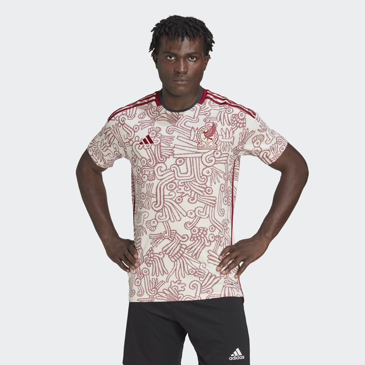
Mexico Away:
Sporting an Aztec x Mixtec inspired design from adidas this year, the Mexico away jersey is a serious contender for us in being quite possibly the best shirt to grace the pitch at the Qatar World Cup.
As an incentive from adidas to help players ‘summon the fighting spirit required to rule the football world’ being the premise of the design, the Quetzalcoatl’s serpent body becomes a notable signoff amidst a sea of red to evoke the unbound capabilities of mankind’s physical form. (Quite fitting for the occasion we must say!).
Couple this with the all-new modernized team badge, Mexico situates hope at the heart of their team’s outlook as a means to “[R]ecognize the best parts of our past but modernize ourselves as well” says De Luisa, the president of the Mexican Football Federation (FMF).
A fantastic improvement over 2018’s fairly basic white-striped design, wouldn’t you agree?
We sure think so!
Argentina Away:
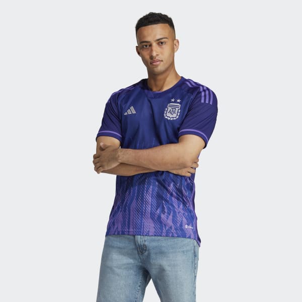
Powered by national pride and a desire to secure a fairer world, Argentina’s away kit sets the tone this year with their kit.
Ditching the forest green and sky blue sleeve cuffs that left a lot to be desired, Argentina’s away kit this year packs a serious punch with its poignant purple colourway, but not without a purpose.
When it comes to designing kits (as we’ve already seen with Mexico), there’s nearly always a meaning behind a team’s blueprint, and this year Argentina pulls out all the stops to express it.
In a bid to promote gender equality, the vibrant purple hues seamlessly blend with fiery graphics from the hem to pay homage to Argentina’s national flag, ‘The Sun of May’.
Said to represent the process of independence that started on 25th May 1810, legend states that the sun broke out when the new Argentinean government was declared and has long since been associated as a symbol steeped in positivity.
What a fantastic sentiment for this year’s world cup! Yet another contender for being one of our favourite designs to finesse the pitch.
Germany Home:
Germany, is it any wonder that this beautiful country time and time again produce some of the finest football wear going?
From their 2014 kit that saw the fantastic red “V” shaped banner strapped across the chest to the 2018 shirt that paid homage to Germany during Italia ’90 when they won the title against Maradona‘s Argentina, it’s safe to say Germany knows how to play in style…
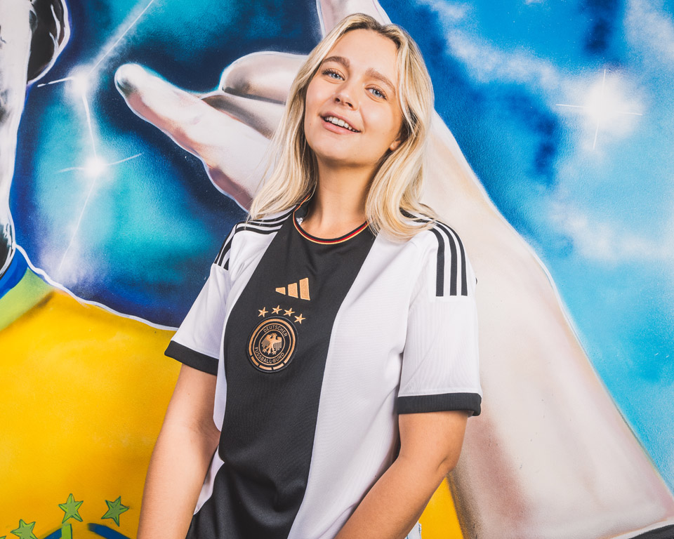
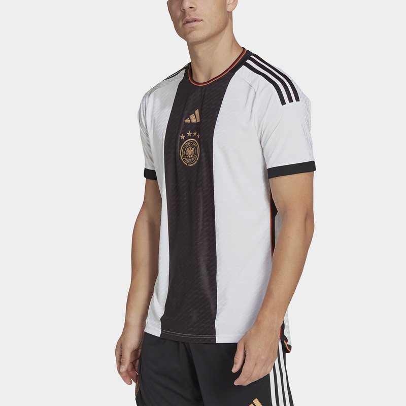
This year is no exception. Placed central to the chest and detailed in gold against the bold vertical stripe, Germany presents a drastic change of direction for modern home shirts and will be showcased when they take on Japan, Spain, and Costa Rica in Group E in the coming weeks.
Combining a white colourway base with bold blacks and officially branded ‘Tactile Gold Metallic’, the kit exudes a similar design to their Euro 2008 away kit. As with many previous Germany Home kits, the flag has been incorporated subtly towards the collar and sides.
It’s hard to find a fault with this one!
South Korea Away
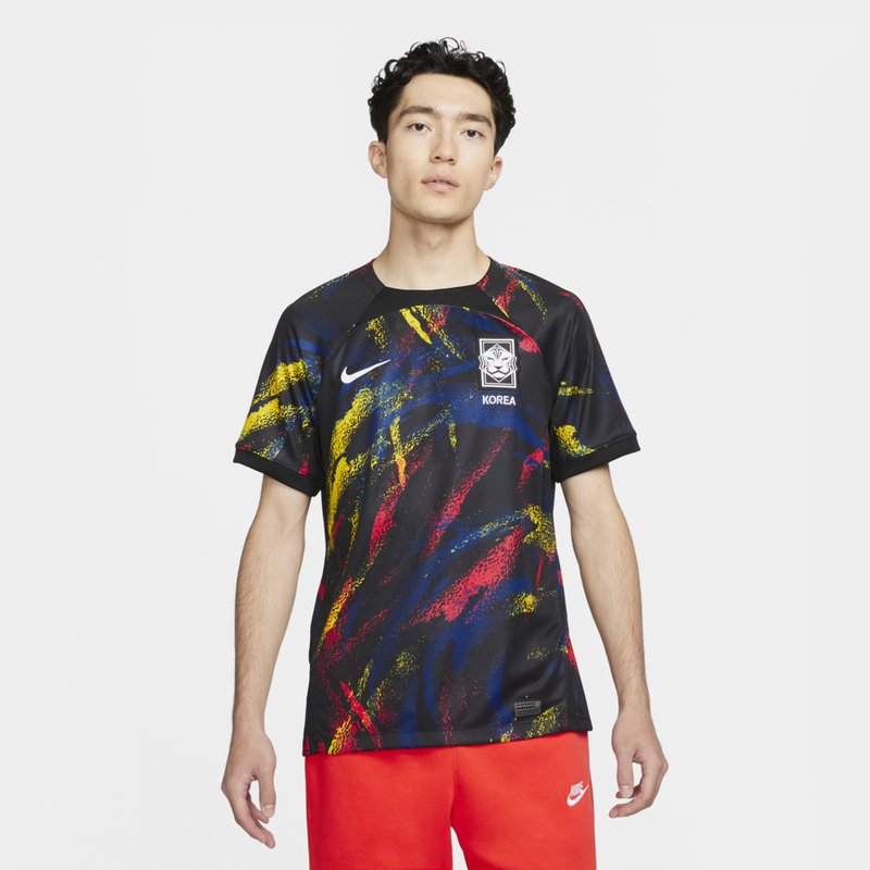
Wow! South Korea’s 2022 World Cup away kit makes a bold statement with this one.
The black base of South Korea’s shirt becomes a clean canvas as splatters of yellow, blue, and red paint fight for our attention.
Yellow hues dominate the edges of the shirt and blend seamlessly into more focused bold blues and radiant reds as we journey to the centre of the shirt. Top this off with the brilliant whites of the Korean crest and Nike logo, and you’ve got us talking.
As a fitting sentiment to their country’s flag, the colours considered for this design have not been selected at random (this is the World Cup remember). With white said to represent purity, black- movement and harmony, and finally, blue and red symbolising positive and negative forces, it is clear that Nike has captured Korea’s spirit with this design.
It’s like a painting produced by Jackson Pollock, and we love it!
England Away
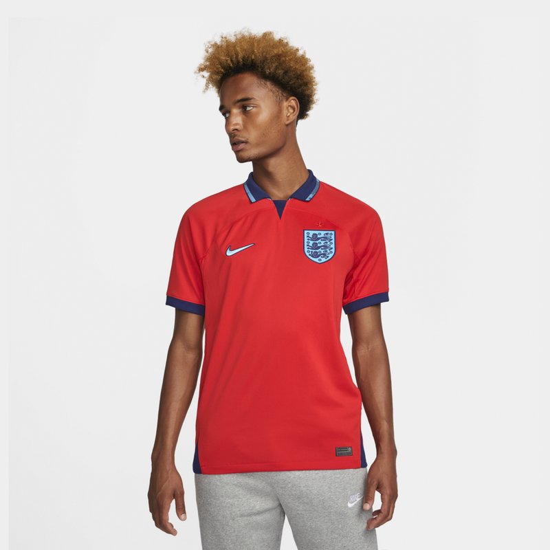
Reminiscent of the classic ’92 Away shirt by Umbro back in the day, it’s safe to say the nostalgia hits hard with this one.
Opting for a ‘Challenge Red’ colourway , with the signature Three-Lions crest and Umbro-esque collar that fuses dark and light shades of blue, it’s clear why the away shirt has been a success with fans across the country.
In place of the old Umbro logo, we see Nike proudly placed to the right of the chest, with the Three Lions crest situated to the left, just above the heart. A clear sentiment to the memories of the many who carry the love for England through.
So simple, so elegant but yet so retro, it’s no wonder we had to place this shirt in our top 10 list of favourites!
Japan Away
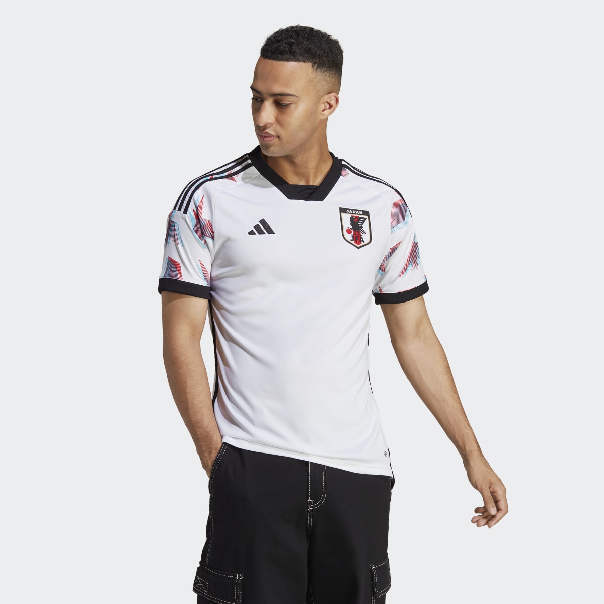
They’ve caught your eye, haven’t they? Those 3D-esque blue and red Origami cranes on the sleeves have you wondering whatever happened to those 3D glasses you once got given free at the cinema…
Packed with Japanese heritage, adidas haven’t missed a thing with their
design of Japan’s Away kit for this year’s World Cup. We might have their home kit to thank for this one!
Taking inspiration from the origami patterns that dominate the blue Home
shirt, the Away kit not only pays tribute to this, but simultaneously stays true to the ‘Samurai Blue’ name.
Stemming from the 1936 Olympics where Japan first wore blue and defeated Sweden 3-2, it’s a no-brainer that the colour became the “amulet of luck” for the country, so why would they change it now?
Couple this with the Japanese flag featured on the back of the shirt and you have Japan presenting one of the cleanest looks in celebrating their identity on the world stage at Qatar.
Ghana Away
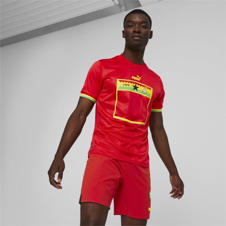
Following the all-new Puma international design template seen on the kits of Morocco, Switzerland, Senegal, Serbia, and Uruguay-safe to say that Puma must be doing something right with this one.
Ditching the slightly more basic design of the 2018 away kit, Puma situates the iconic Black star and Ghanian flag at the centre of their red colourway, alongside accented yellow and green detailing on both the chest and cuffs to pay homage in style.
While there is a lot to love about Ghana’s latest gear, future additions could see an improvement in the design if Puma were to experiment out of the box (quite literally, look at that open space in that rectangle!).
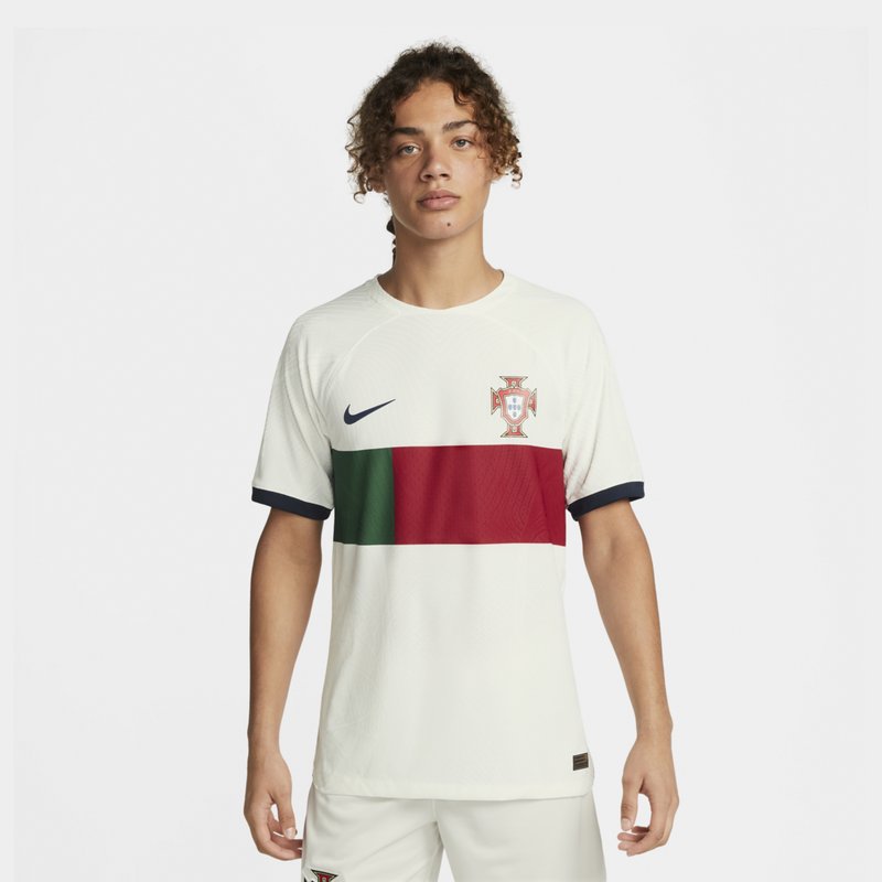
Portugal Away
When it comes to Nike, they’ve certainly done the rounds with Portugal over the past decade to help perfect their World Cup kits.
Paying homage to what feels like a throwback to the days of Luis Figo, the off-white base with a navy swoosh and the red and green colour-block design seriously packs a punch.
Taking inspiration from the Nike 22-23 template seen on the likes of Atletico’s and Liverpool’s 22-23 Home shirt, the black back collar panel, swoosh, and matching sleeve cuffs can’t help but center our attention towards the country’s flag and crest.
As a sentiment synonymous with unfaltering and everlasting loyalty to the team, this may be the nicest shirt unveiled for Qatar.
Despite having fallen in love with the subtle green and red crosses of the 2018 design -a sensational idea from Nike- we feel this year’s shirt is a real contender.
Belgium Home
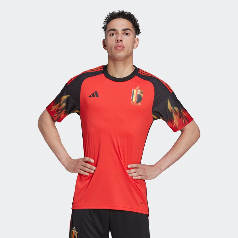
The ‘Red Devils’ didn’t earn their name for no reason…
Gone is the retro throwback sentiment of 2018 that took inspiration from one of the most iconic designs to come out of the 1984 World Cup. Instead, adidas now looks forward and has set their sights on honouring Belgium with an all-new, highly compelling design and we can’t lie to you, we love it!
Burning bright with their latest Home kit, Belgium confirms that flames are definitely “in” this season, but is it any surprise after seeing the punchy purple flames on the kit of Argentina? Adidas might be on to something here.
Sporting a classic red colourway with black raglan sleeves, adidas could have left the design there and we’d still be lining up to get our hands on one.
No, instead red and yellow flames engulf the sleeves and rise towards the signature stripes adidas is known for to complete a smart, yet highly sophisticated look that should be enough to intimidate their group F rivals, Croatia, Morocco, and Canada.
Brazil Home
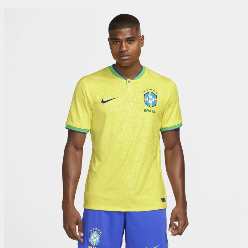
Manifesting an all-new ‘Dynamic Yellow’ colourway for this year’s design, it’s safe to say that Nike hasn’t left a stone unturned when it comes to paying their respects to Brazilian heritage…
Featuring a sensational, yet subtle, debossed jaguar pattern that is more prominently seen on their Away kit, the fur of the Jaguar remains a stunning sentiment, making proud links with Brazil’s Amazon Rainforest.
Hold up… the inspiration for the design doesn’t stop there!
Five stars crown the badge in celebration of past victories at the 1958, 1962, 1970, and 2002 World Cups, cementing Brazil’s position as the team at the very top of international football.
Couple this with the traditional 3 C’s: crest, collar, and cuffs coloured in green with decorative blue striping and the look is complete.
We’d like to say what you see is what you get with this design, but with its numerous subtle additions, even we wouldn’t be surprised if there was something we’d missed!
Agree with our choices? Perhaps you think we’ve missed a team off the list? Let us know in the comments which World Cup shirt is your favourite, we’d love to hear from you!

